(all of my blog posts are starting to look alike, aren't they?)
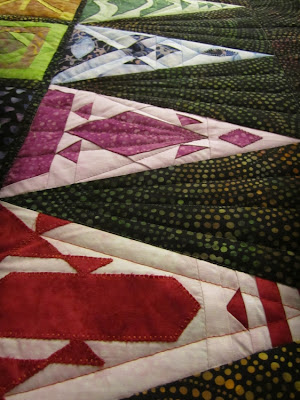
Again, the photos are a bit blurry because they were taken in low light to show the quilting. Click on the photos for a larger view.
I'm not going overboard with the quilting -- I'm trying to keep it minimal in order to keep my sanity....


2 comments:
Love watching your progress through this quilt. The rays in the setting triangles are a great choice. Contrasts with the curves in the fabric, bit doesn't detract from all the design in the pieced triangles.
You have done a beautiful job on this quilt. You must be so proud of it.
Post a Comment